


Creating logos goes smoother when there's good communication between the client and the designer. We often find that our clients have a clear idea of what they want, but they have a hard time explaining it to us. Since designers need that feedback, if the brief isn't detailed or the client can't quite find the right words to describe their vision, it can take more time to come up with the final design than the original scope.
The easiest way to steer clear of this is to start with a good brief. Try to keep it simple and clear. Just make sure it touches on what you need without getting too detailed, or it might hold back the design. A good brief usually includes some examples of logos you might like, details about the target audience, and what message the logo should communicate. A bit of design knowledge can be helpful too, but it’s not a must.
Here's a handy list of things your designer wants you to keep in mind.
Describing
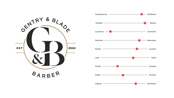
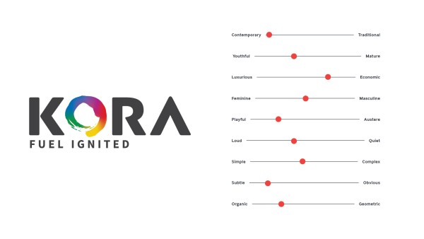
A logo can say a ton about your brand, which is why it’s super important to know the story you want it to tell. We’ve included a map below to show just how crucial it is to communicate clearly with a designer when creating your logo. As you’ll see, the extremes on each end of the lines leads to totally different designs - these examples also focus only on one single descriptor. Usually, a brand will blend multiple messages together.
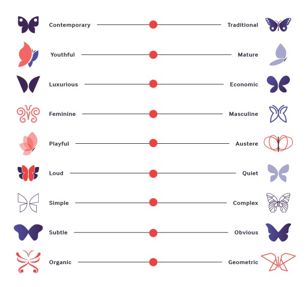
When you think about your design, picture the middle slider moving along the lines to help make your idea feel just right.
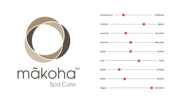
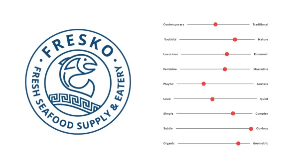
Below are some examples of logos and how the map adjusts to each.
Style
Style plays a big role in design, but you don’t need to dive into all the technical stuff. We don’t need you to know what Swiss design or Art Nouveau are. What really matters is knowing what look you like best. So, a great way to share that with us is through examples instead of only discussing the logo design. Before you put together your logo brief, take a bit of time to browse Pinterest or Google. Try adding some of those keywords from the previous map. We’ll handle the rest from there!
Design jargon
As mentioned above, graphic design involves a lot of terminology. While terms like "sans serif" and "kerning" aren't terms that you, the client, need to understand, you'll probably come across a few key words during the design process. Below is a list of terms that we think are useful to know:
Logotype:
A logotype is basically just the name of a company using only the font. Think of brands like Google and Coca-Cola!
Logomark:
A logomark is the graphic that helps people recognize a brand. Think of things like the golden arches from McDonald's, Nike's “tick” or the famous Apple logo.
Typography:
Typography is all about text and fonts. Designers usually prefer this term over "text" because it highlights that we're focusing on type design instead of just written content.
Target audience:
The target audience is really just about what demographic of people your brand is all about. Who do you want to connect with? A brand might focus on things like age range, gender, and socio-economic status.
Hierarchy:
Hierarchy is just a way to show which parts of a design matter most and which ones matter less. The most important stuff should be what catches your eye first — usually the biggest item, placed at the top or top left of the design (if you're looking at it from a western viewpoint).
Vector:
Vector is the format that all logos should be produced in. It uses paths instead of pixels — kind of like those parabolas you learned about in high school maths. This makes your design infinitely scalable, so if you need to print your logo on a giant sign, it’ll stay sharp and won’t look pixelated at all.
Pantone:
The Pantone Matching System (PMS) is a color system that helps everyone approximate shades. Each color has its own number, so it’s easy to find and recreate the exact colors you need. A design will print differently from printer to printer, so we use pantone colours to test and match the designs. That’s why it’s important to assign pantone colours to your logo design.
Brand Guide:
A brand guide is something that’s created alongside a logo design. It will detail many things about the brand, such as the best ways to use your logo suite, what colours the brand uses, what typography goes well with it, and what not to do with the logo.
Specifications
Here’s a list of specifications that are important for your finished logo suite.
Logo variations:
Different logo compositions work best in different areas. We usually recommend at least 2-3 logo variations per brand. These are usually a horizontal logo, a stacked logo, and icon only version if the design uses a logomark. As well as the composition variations, a logo suite should have multiple colour options - black, white and full colour at least.
Vector and pixel versions:
As mentioned previously, vector files are best used for print, these file types are things like PDFs, SVGs and EPS files. Pixel files are used for digital content. These are JPGs, PNGs and TIFs. A logo suite will have a mix of both types.
RGB and CMYK versions:
If your logo has a lot of colour options, it’s a good idea to separate the logo types into RGB and CMYK colour options. This is because colours can visually differ when converted over from one to the other. You’ll want to use RGB versions for digital use, and CMYK versions for print.
By following the tips we shared, you'll be able to put together a solid logo brief with better understanding of the logo design process. Having a clear and detailed brief is super important to make sure your design matches your vision and captures what your brand is all about.
To help you out even more, check out more of our website where we've got tons of logo examples for you to explore - you're sure to find some great inspiration and different design styles. And if you've got a unique brand idea you want to chat about or develop further, don’t hesitate to reach out for a custom quote. We’re here to help you create a logo that truly represents you and your brand!